

Part 1 asked whether Bitcoin was one price across exchanges. This half asks a portfolio question: were the altcoins genuinely different assets, or eight tickers for the same bet?
The 2018 altcoin pitch leaned on diversification — don’t just hold BTC, spread across ETH, LTC, XRP and friends. Whether that spreads risk depends entirely on correlation, and correlation is measurable. Same toolkit as before, prices for eight major coins, everything converted to daily returns:
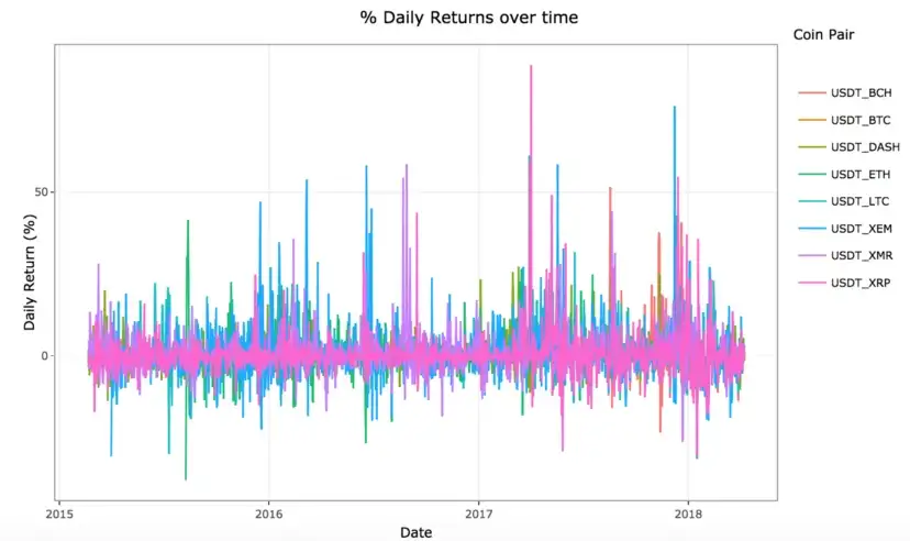
Even before any statistics, your eye catches it: the spikes line up. When one panel goes wild, they all do. The correlation matrix makes it precise:
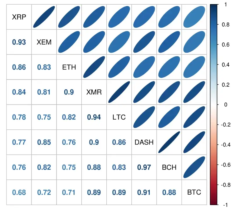
Nearly every pair sits between 0.7 and 0.95. In equity terms those are numbers you’d expect within one sector, not across an asset class. Drawn as a network, with distance standing for independence, the “diverse” portfolio collapses into one tight tangle:
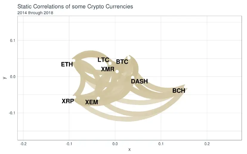
Eight names, one knot. Holding five of these wasn’t diversification; it was the same position with extra fees.
The part that should worry a portfolio
Averages hide the dangerous detail, so I rolled the BTC–LTC correlation month by month:
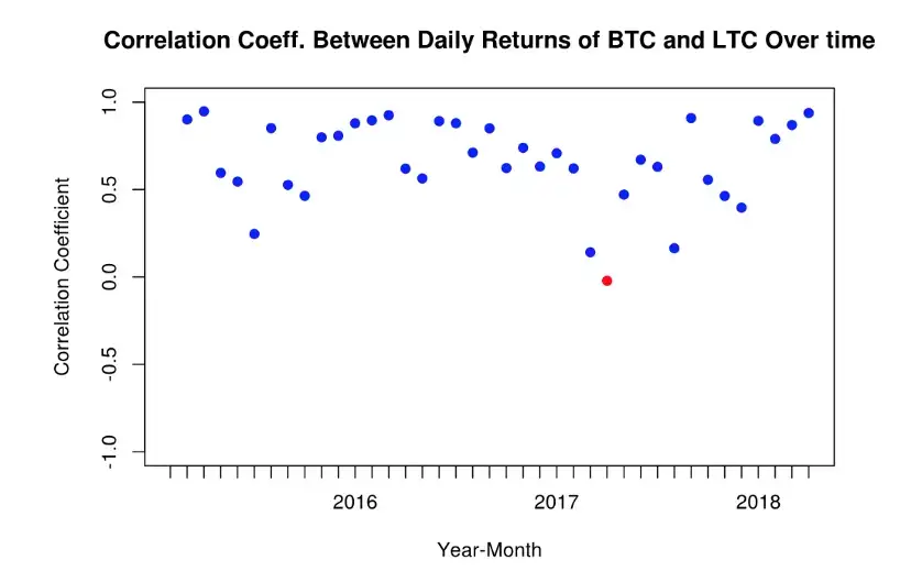
The dips toward independence happen in calm stretches. In stressed ones the correlation pins to the top of the range — and the 2018 price panels show what that meant in practice:
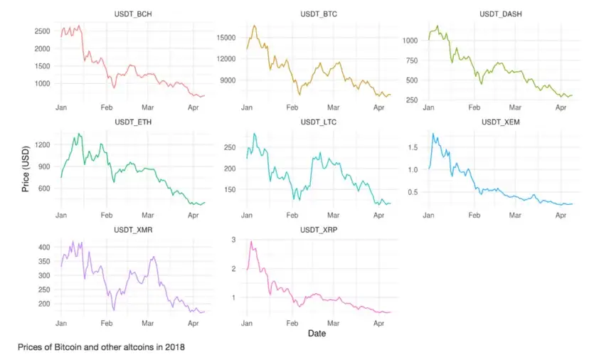
Eight charts, one shape, all pointing down together. Which is the general and much older lesson this data illustrates unusually cleanly: correlations rise exactly when you need them low. Diversification quoted from peaceful averages evaporates in a crisis, in crypto and everywhere else — 2008 taught equity investors the same thing at greater expense.
Would I expect identical numbers today? No; the market has had years to mature, and I’d want fresh data before claiming anything about now. But the method is the reusable part: returns, not prices; correlations over time, not on average; and a hard look at exactly the periods your model is most tempted to smooth over.