

In 2018 I got curious about a question with real money attached: is Bitcoin’s price actually one price? Every exchange quotes its own, arbitrage is supposed to keep them honest, and I had seven years of data to check whether it did.
The toolkit was ordinary R: data.table and lubridate for wrangling, ggplot2 for the pictures, with price series pulled from Quandl’s exchange feeds and the Poloniex API. Those feeds are gone now, which is why this post carries the note above. The method outlives the plumbing.
First, the shape of the thing we’re analysing:
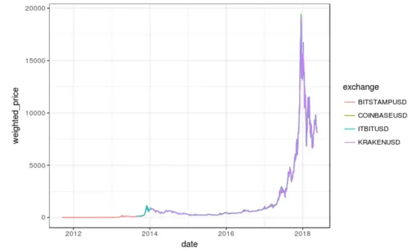
That spike is late 2017, and everything interesting in this analysis happens in its shadow.
How far apart could one Bitcoin be from itself?
For each day I computed the maximum percentage gap between the highest and lowest price across exchanges — the raw material of arbitrage. Plotted over time, with a loess smoother:
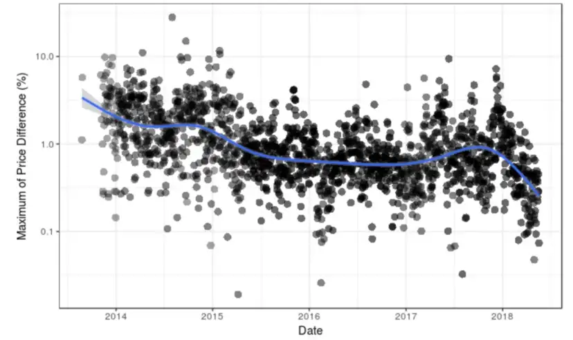
Two things jump out. The typical gap declined over the years (the market maturing, arbitrageurs doing their job), but the spread never disappeared, and single days still spiked to 10% and beyond deep into the study. The monthly view says the same thing with distributions instead of dots:
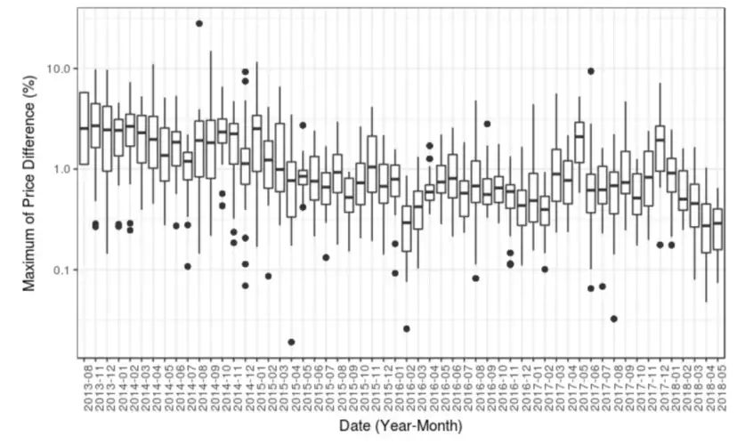
Medians settle around a percent. The tails never behave. And when I asked which exchanges kept showing up at the extremes, the answer wasn’t random either:
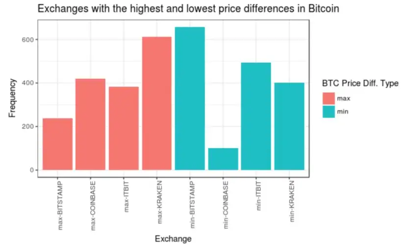
A handful of venues were persistently the expensive place and a handful persistently the cheap one. Textbook arbitrage says gaps like that get eaten within minutes. So why did they persist for years?
Because the friction was real: withdrawal limits and delays, fees on both sides, counterparty risk on venues of very mixed reliability, and transfer times during exactly the volatile moments when gaps opened. The chart records the size of the reward; the frictions were the moat around it. “Free money” that persists is almost always a measurement of some cost you haven’t priced.
That finding — markets are one market only when moving between them is cheap — is the whole lesson, and it generalises far past crypto. Part 2 turns from one coin on many exchanges to many coins moving together, where the correlation structure has its own surprise.