Analyzing Crypto Market using R — Part 2
Correlations in the Crypto World
Analyzing crypto market
Aous Abdo, WWW.ANALYTICADSS.COM
An interactive version of this post can be found on here.
In my previous post I explored bitcoin data from different exchanges, we also covered some arbitrage-related data. In part 2 of this series I will explore alt coin related data.
R Libraries
Below is a list of R libraries we will be using to help us with our analysis. Not all of them are necessary but they all will make our life easier.
library(PoloniexR)
library(data.table)
library(lubridate)
library(Quandl)
library(plyr)
library(stringr)
library(ggplot2)
library(plotly)
library(janitor)
library(quantmod)
library(pryr)
library(corrplot)
library(PerformanceAnalytics)
library(tidyr)
library(MLmetrics)
library(tidyquant)
library(corrr)
library(cowplot)
Data
The best source I know off to get alt-coin data is through PoloniexR. I have written an R function to help download data.
get_alt_data <- function(tz = "UTC"
                         , coin = c("ETH", "LTC")
                         , add_bitcoin = TRUE
                         , return_in_USDT = TRUE
                         , from = "2017-01-01"
                         , to = "2018-04-09"
                         , period = "D"
                         , verbose = FALSE){

  # We will be using the public API
  poloniex.public <- PoloniexPublicAPI()

  # set the time zone to utc
  Sys.setenv(tz = tz)

  # convert from and to into time obj
  from  <- as.POSIXct(paste(from, tz, sep = ""))
  to    <- as.POSIXct(paste(to, tz, sep = ""))

  # lists to store data.tables and xts objects
  chart_list <- list()
  dt_list    <- list()

  # make sure the coin pair is in upper case
  coin       <- toupper(coin)
  coin_pairs <- paste0("BTC_", coin[coin != "BTC"])
  if(add_bitcoin | return_in_USDT) coin_pairs <- c("USDT_BTC", coin_pairs)

  # loop over the coins to get the data
  for(i in coin_pairs){
    if(verbose)
      invisible(cat('\tGetting data for ', i, ' pair\n'))

    # this is a list that will contain the chart data for each coin pair
    try(chart_list[[i]] <- ReturnChartData(theObject = poloniex.public
                                       , pair      = i
                                       , from      = from
                                       , to        = to
                                       , period    = period)
        , silent = TRUE)

    # list to contain data.tables
    try(dt_list[[i]] <- as.data.table(chart_list[[i]]), silent = TRUE)
  }

  # convert to data.table and make sure to add a column containing the pairs
  coin_dt <- rbindlist(l = dt_list, use.names = TRUE, idcol = "pair")

  # return data in usdt prices
  if(return_in_USDT){
    # to get the price of the alt coin in usdt is not that simple but we'll do it
    # get a DT of the btc_usdt pair
    btc_usd <- coin_dt[pair == "USDT_BTC"]
    btc_usd <- btc_usd[, .(index, pair, weightedaverage)]
    setnames(btc_usd, c("Date", "USDT_BTC_pair", "USDT_BTC_price"))

    # get DT with only alt coins
    alt_coins <- copy(coin_dt)#[pair != "USDT_BTC"]

    # now we need to add an index to the alt_coins table, but first we have to rename the index column
    alt_coins[, Date := index]
    alt_coins[, index := 1:.N]
    setkey(alt_coins, index)

    # now merge the data tables
    coin_dt_usdt <- merge(x = alt_coins, y = btc_usd, by = "Date")

    # now calcualte the price in usdt
    coin_dt_usdt[, price_usdt := ifelse(pair == "USDT_BTC", USDT_BTC_price, weightedaverage * USDT_BTC_price)]

    # now get rid of the extra columns
    coin_dt_usdt[, c("USDT_BTC_price", "USDT_BTC_pair") := NULL]

    # we need to change some column names
    col_names_to_change <- c("pair", "high", "low", "open", "close", "volume", "quotevolume", "weightedaverage")
    col_names <- names(coin_dt_usdt)
    col_names[col_names %in% col_names_to_change] <- paste0(col_names_to_change, '_btc')

    setnames(coin_dt_usdt, col_names)

    # add a column for the usdt pair
    coin_dt_usdt[, pair_usdt := gsub("BTC_", "USDT_", pair_btc)]

    # adjust col order
    setcolorder(coin_dt_usdt, c(1:10, 12, 11))

    # set key again
    setkey(coin_dt_usdt, index)

    # now get rid of the index column since it is not needed anymore
    coin_dt_usdt[, index := NULL]

    # now put together the return list
    return_list <- list(alt_chart_list = chart_list, alt_dt = coin_dt, alt_usdt_dt = coin_dt_usdt)
  }else{
    return_list <- list(alt_chart_list = chart_list, alt_dt = coin_dt)
  }

  return(return_list)
}
The function above can be used to download data for multiple coin at the same time. The function returns a data.table object with data for all coins in the function call. Even if the user doesn’t add bitcoin to the list of coins, the function adds bitcoin by default. This can be deactivated with the add_bitcoin argument. Here is an example
# get alt data for some coins
alt_data <- get_alt_data(return_in_USDT = T
                         , from = "2015-01-01"
                         , coin = c('ETH','XRP', 'BCH', 'LTC', 'NEO', 'XMR', 'DASH', 'XEM'))[['alt_usdt_dt']]
Let’s look at the data we just downloaded
head(alt_data)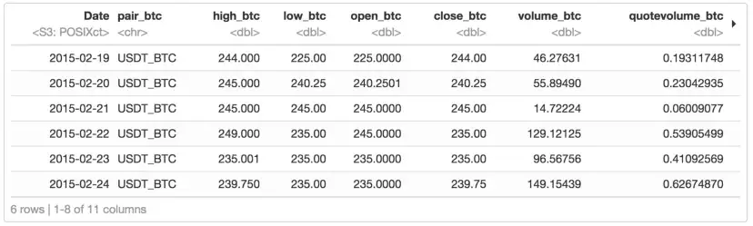
The table shows the date, OHLC, Volume, and weightedaverage price in BTC. It also shows the pair and we added the price in USD.
Bitcoin-Altcoins Correlations
Wheneven I look at the prices of the coins available on my coinbase app I always get struck by the similarity of the price trends between the four coins available on coinbase: BTC, ETH, BCH, and LTC, see Figure below. So I thought it will be a good idea to explore the correlation in price trends between altcoins and bitcoin.
Let’s look at price trends of the coins we just downloaded. To better see potential correlations I am going to only zoom in on 2018.
p <- ggplot(alt_data[year(Date) == 2018], aes(x = Date, y =  price_usdt, col = pair_usdt)) + geom_line()
p <- p + facet_wrap(~pair_usdt, scales = "free", ncol = 3) + theme_minimal() + theme(legend.position="none") + ylab("Price (USD)")
p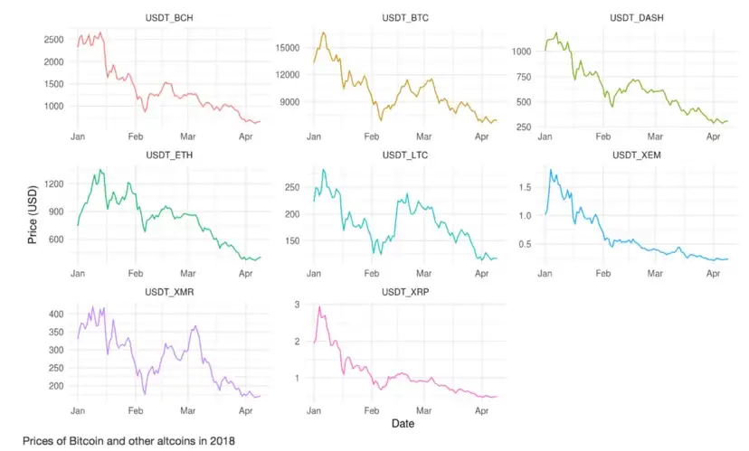
The figure above shows that some coins seems to be more correlated with Bitcoin than others. The figure also shows that this variablity between Bitcoin and another coin varies over time. More on this below.
Tyring to find correlations bewteen time series data using Pearson correlation coefficient or other metrics used with stationary data, time series is not a form of stationary data, can give misleading results. Similar trends in time series data can also be very misleading, a nice article on this topic can be found here. And always remember that Correlation doesn’t guarantee Causation
Bottom line is the following, one has to be careful when cross-correlating time serice. In order to perform proper correlation analysis we need to add some new variables to our table.
Percentage Daily Change
Percentage daily change calculates the price change of a coin over a period of a day. Let’s add that to the table. Notice that we are calcualting this variable using the USD price, and not the price in Bitcoin.
# add daily price change
alt_data[, pct_change := Delt(price_usdt), by = pair_usdt]
Normalized Price in USD
Since the prices vary a lot, both overtime for the same coin and between coins, we will add a variable of the normalized price in USD. This variable will make it easy to plot prices of coins on the same figure.
# add normalized prices in udst
alt_data[, price_usdt_norm := price_usdt/max(price_usdt), by = pair_usdt]
Now that we have the normalized prices in USD, let’s look at the prices of bitcoin and litcoin on the same figure. We’ll do that for 2018 so we can better see any possible correlations.
p <- ggplot(alt_data[year(Date) == 2018 & pair_usdt %like% "BTC|LTC"], aes(x = Date, y =  price_usdt_norm, col = pair_usdt)) + geom_line()
p <- p + theme_minimal() + ylab("Price (USD)")
ggplotly(p)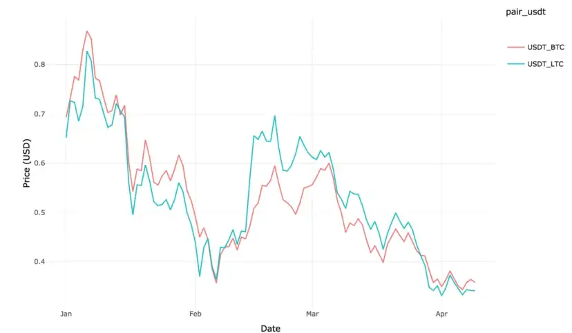
The trends in the prices of BTC and LTC are very similar, Let’s look at price trends for 2017
p <- ggplot(alt_data[year(Date) == 2017 & pair_usdt %like% "BTC|LTC"], aes(x = Date, y =  price_usdt_norm, col = pair_usdt)) + geom_line()
p <- p + theme_minimal() + ylab("Price (USD)")
ggplotly(p)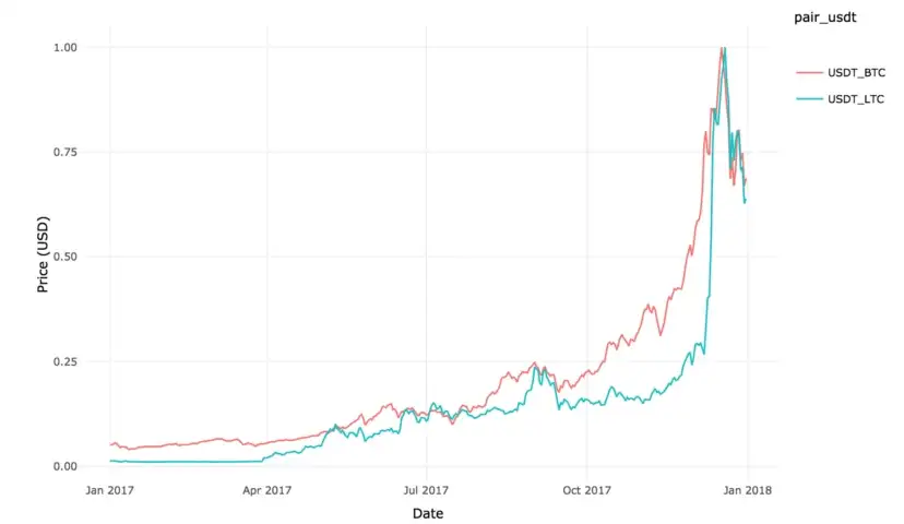
Seems like we need to zoon in on the last quarter of 2017, let’s do that
p <- ggplot(alt_data[Date >= "2017-10-01"  & Date < "2018-01-01" &  pair_usdt %like% "BTC|LTC"], aes(x = Date, y =  price_usdt_norm, col = pair_usdt)) + geom_line()
p <- p + theme_minimal() + ylab("Price (USD)")
ggplotly(p)

It is clear from the above figure that the correlation in the prices of bitcoin and LTC vary over time. Note how the highest price for bitcoin on December 17 2017, preceded that of LTC by two days, which occurred on December 19 2017. This wasn’t the case for the ATH which occurred on January 6th 2018 for both coins.
Static Correlations
(and why you shouldn’t use them with crypto!)
Up until now I haven’t calculated any correltaions between the price of different coins. You might ask why should we even care about correlations in time series. Well, in the case of financial time series data, if one can show that a correlation exists between two time series then one can use this correlation to model/predict the price movement of one coin/stock given the price trends of another coin/stock.
However, as we mentioned earlier, correlation for time series data is not static, it changes over time. Actually let’s show that. To do that I am going to be calculating the Pearson correlation coefficient. In simple words, Pearson correlation coefficient for two vectors of data is a measure that shows how correlated these two vectors of data are. The value of this coefficient varies from -1, perfectly anti-correlated, to 1, perfectly correlated. So the correlation coefficient for a series of numbers on itself is 1. A value of zero means these is no correlation. Remember, this only works for static data.
In order to perform correlation on our data I am going to need to do some data transformation:
# subset data, only keep the date, the pair, and the price
alt_data_sub <- alt_data[, .(Date, pair_usdt, price_usdt)]
# convert to wide format
alt_data_sub <- spread(data = alt_data_sub, key = "pair_usdt", value = "price_usdt")
# clean column names
setnames(alt_data_sub, gsub("USDT_", "", colnames(alt_data_sub)))
The new table we created contains the date along with the prices in USDT for each coin we have in our table.
tail(alt_data_sub)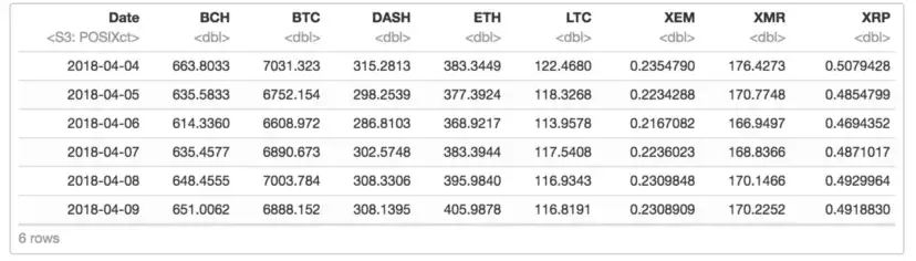
Again, what I am doing here is not correct, I am just trying to show you why we shouldn’t be doing static correlations on crypto data. Now we’ll calculate the Pearson correlation coefficient between the coins we have, then we are going to make a nice plot of these coefficients.
# calculate the correlation matrix
M <- cor(alt_data_sub[, -1], use = "complete.obs") # notice how we are ignoring missing data with the last argument
# plot the correlation matrix
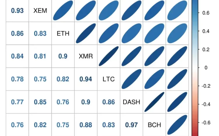
corrplot.mixed(corr = M, upper = "ellipse", lower = "number", order = "AOE", tl.col = "black")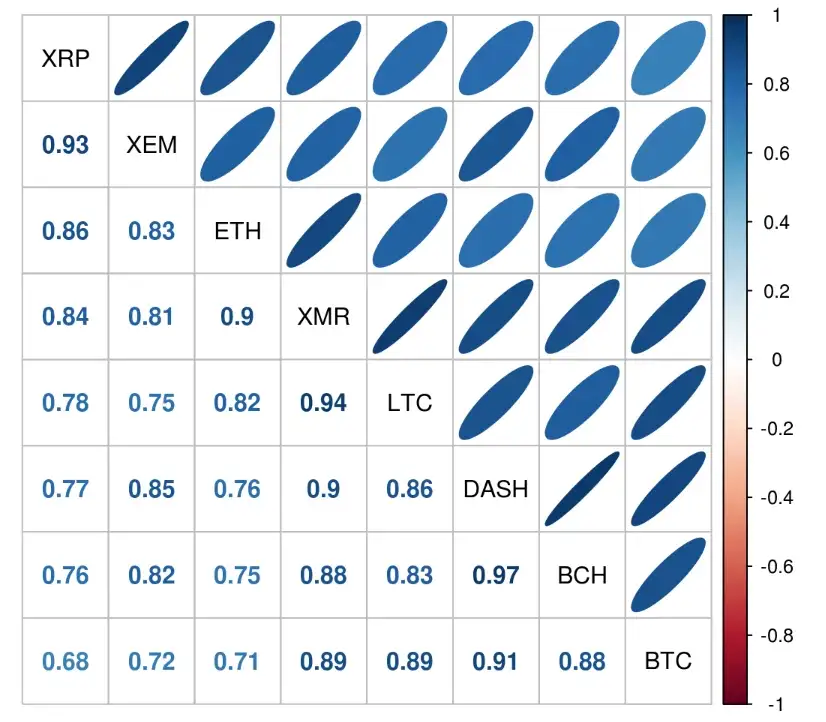
The figure above shows the correlation coefficients between the different coins. It is easy to read, visually, the darker the color of the ellipse, and the more diagonal the ellipse, the higher the correlation coefficient. Of course you can also just look at the numbers on the bottom left part of the figure to get the value of the coefficient between two coins :). The figure shows how highly correlated the prices of crypto currencies can be. For example XRP and XEM have a correlation coefficient of 0.93. The highest correlation seems to be between BCH and DASH at 0.97 correlation coefficient.
All of the correlation coefficient we see in the above figure are significant, the question is, do these correlations vary over time. To answer this question I will calculate the correlation coefficient between Bitcoin and DASH on a monthly basis, you can do that for any time period, and will show that this coefficient varies greatly over time. Let’s do that
# subset the data
btc_dash <- alt_data_sub[, .(Date, BTC, DASH)]
# add a year_month column
btc_dash[, year_month := as.yearmon(Date)]
# calculate the correlation coefficient on montly basis
btc_dash_2 <- btc_dash[, cor(BTC, DASH), by = year_month]
# now plot the correlation coefficient as a function of month and year
plot(btc_dash_2$year_month, btc_dash_2$V1, xlab = "Year-Month", main = "Correlation Coeff. Between BTC and DASH Over time"
     , ylab = "Correlation Coefficient", type = "b", pch = 19, col = ifelse(btc_dash_2$V1 > 0, "blue", "red")
     , ylim = c(-1, 1))
This is interesting, the value of the monthly correlation coefficient between bitcoin and DASH varies between -0.91, highly anti-correlated, to 0.98, highly correlated. And this is why you should never use static correlation metrics with crypto data!
A good blog post on this same topic is written by Tom Fawcett from Silicon Valley Data Science and can be found here. In his post Tom shows, with simple simulations, why static correlations should never be used with time series.
Correlation Networks
There is one more plot I would like to make, which is a network plot of the correlations between the different coins. The correlation network plot helps show strengths of correlation between the different coins. Agian, these correlations are time dependent and the figure we will be making will change over time, but I still think it is a good figure to make. Here it is:
# we will be using the great corrr package for this work
# get the correlation matrix, just like we did before
# build the correlation matrix
# the code snippets below are taken from, that is a great blog BTW
# http://www.business-science.io/timeseries-analysis/2017/07/30/tidy-timeseries-analysis-pt-3.html
corr_2 <- correlate(alt_data_sub[, -1])
# make the network plot
# Network plot
corr_net <- corr_2 %>%
  network_plot(colours = c(palette_light()[[2]], "white", palette_light()[[4]]), legend = TRUE) +
  labs(
    title = "Static Correlations of some Crypto Currencies",
    subtitle = "2014 through 2018"
  ) +
  theme_tq() +
  theme(legend.position = "bottom")
corr_net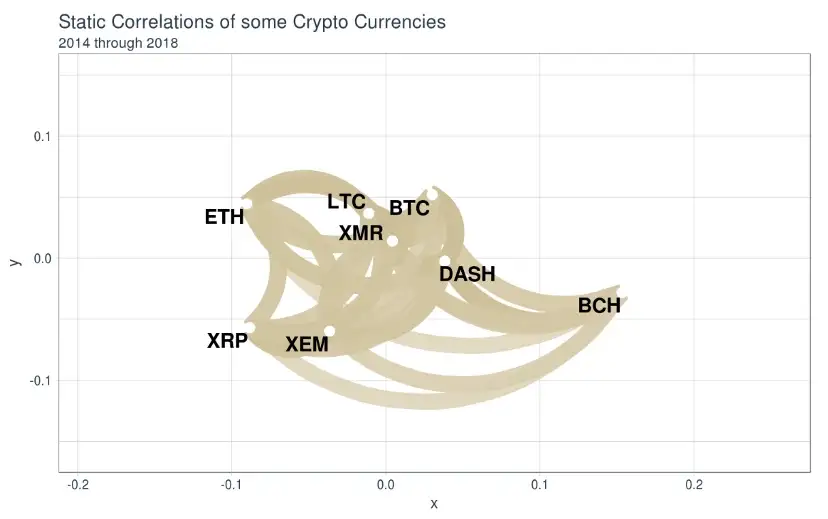
The figure above shows a network which measures how strongly correlated the prices of the coins under stugy are. The darker the color of the edge, line, connecting two coins and the closer they are in the network the stronger the correlation between these two coins.
From the figure, it seems like XMR, LTC, and BTC are in the heart of this network, while BCH seems to be the least correlated with the rest of the coins. Let’s see how the network plot changes between 2017 and 2018:
# subset the data and get correlation matrices
corr_2017 <- correlate(alt_data_sub[year(Date) == 2017][, -1])
corr_2018 <- correlate(alt_data_sub[year(Date) == 2018][, -1])
# build Network plots
corr_net_2017 <- corr_2017 %>%
  network_plot(colours = c(palette_light()[[2]], "white", palette_light()[[4]]), legend = TRUE) +
  labs(
    title = "Static Correlations of some Crypto Currencies",
    subtitle = "2017"
  ) +
  theme_tq() +
  theme(legend.position = "bottom")
corr_net_2018 <- corr_2018 %>%
  network_plot(colours = c(palette_light()[[2]], "white", palette_light()[[4]]), legend = TRUE) +
  labs(
    title = "Static Correlations of some Crypto Currencies",
    subtitle = "2018"
  ) +
  theme_tq() +
  theme(legend.position = "bottom")
# combine network plots
cow_net_plots <-plot_grid(corr_net_2017, corr_net_2018, ncol = 2)
title <- ggdraw() +
    draw_label(label = 'Crypto Correlation Networks',
               fontface = 'bold', size = 18)
cow_out <- plot_grid(title, cow_net_plots, ncol=1, rel_heights=c(0.1, 1))
cow_out
As can be seen, the correlation networks do change overtime. This is not news since we already saw in the previous section that the value of the correlation varies overtime (I know we showed this to be true for the BTC-DASH air but we’ll show that this is true for the rest of the coins in the next section.)
Daily Returns Correlations
Let’s look at the percentage daily changes of the altcoins between 2015 and today.
# plot the percent changes
p <- ggplot(alt_data[Date > ymd("2015-01-01")], aes(x = Date, y =  (100*pct_change), col = pair_usdt)) + geom_line()
p <- p + ggtitle("% Daily Returns over time") + ylab("Daily Return (%)")
p <- p + theme_bw() + guides(col=guide_legend(title="Coin Pair"))
ggplotly(p)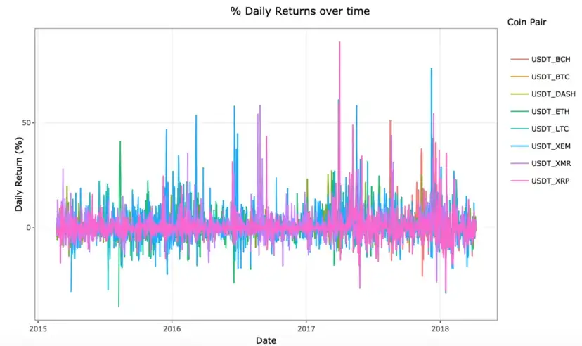
Although the above figure is very cluttered, one thing is certain, percentage daily returns vary greatly for crypto. Let’s try to make this figure a bit easier to read
p <- ggplot(alt_data[Date > ymd("2015-01-01")], aes(x = Date, y =  (100*pct_change), col = pair_usdt)) + geom_line() + facet_wrap(~ pair_usdt)
p <- p + ggtitle("Percentage Daily Returns over time") + ylab("Daily Return (%)")
p <- p + theme_bw() + theme(legend.position="none")
ggplotly(p)
It is kind of surprising that Bitcoin has the least variability in daily returns. The nice big spike around April 2nd 2017 shows a percentage daily return of ~88% for XRP, this is the highest daily return I have seen!
Let’s look at the percentage daily returns for Bitcoin and Litecoin since they seem to be highly correlated. I am going to zoom in on the time period 2016–02–01 and 2016–05–01.
start_date <- ymd("2016-02-01")
end_date <- ymd("2016-05-01")
p <- ggplot(alt_data[pair_usdt %like% "BTC|LTC" & Date > start_date & Date < end_date], aes(x = Date, y =  (100*pct_change), col = pair_usdt)) + geom_line() + theme_bw() + ylab("Price (USD)")
p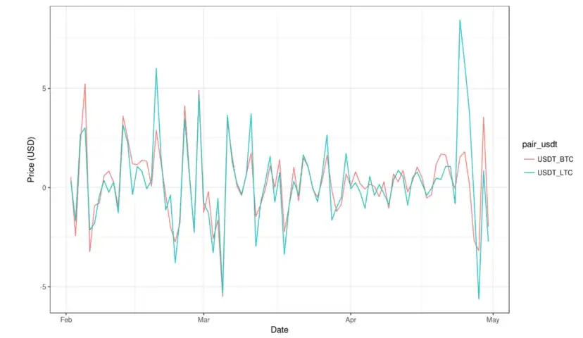
The figure shows clear correlation between the daily returns of Bitcoin and litcoin. It also shows that these correlations can vary overtime. In fact, let’s look at how these correlations vary overtime.
# these steps are similar to the ones in the previous section, the only differnect is that now we are looking at the percentage change in price difference on daily basis instead of the actual price
# subset data, only keep the date, the pair, and the price
alt_data_sub_pct <- alt_data[, .(Date, pair_usdt, pct_change)]
# convert to wide format
alt_data_sub_pct <- spread(data = alt_data_sub_pct, key = "pair_usdt", value = "pct_change")
# clean column names
setnames(alt_data_sub_pct, gsub("USDT_", "", colnames(alt_data_sub)))
# subset the data
btc_ltc <- alt_data_sub_pct[, .(Date, BTC, LTC)]
# add a year_month column
btc_ltc[, year_month := as.yearmon(Date)]
# calculate the correlation coefficient on montly basis
btc_ltc_2 <- btc_ltc[, cor(BTC, LTC), by = year_month]
# now plot the correlation coefficient as a function of month and year
plot(btc_ltc_2$year_month, btc_ltc_2$V1, xlab = "Year-Month", main = "Correlation Coeff. Between Daily Returns of BTC and LTC Over time"
     , ylab = "Correlation Coefficient", type = "b", pch = 19, col = ifelse(btc_ltc_2$V1 > 0, "blue", "red")
     , ylim = c(-1, 1))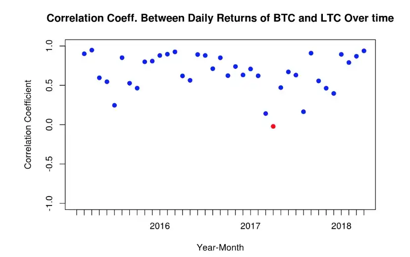
Interesting, the correlation between the percentage daily change of the prices for bitcoin and litecoin is much more on the positive side, we only have one month in which this correlation is negtive, barely negative. This is a lot different than what we saw between Bitcoin and DASH, but that was for the actual prices and not the daily returns. Let’s redo this plot but his time for the actual prices for bitcoin and litecoin, just like we did with DASH.
# subset the data
btc_ltc_price <- alt_data_sub[, .(Date, BTC, LTC)]
# add a year_month column
btc_ltc_price[, year_month := as.yearmon(Date)]
# calculate the correlation coefficient on montly basis
btc_ltc_price_2 <- btc_ltc_price[, cor(BTC, LTC), by = year_month]
# now plot the correlation coefficient as a function of month and year
plot(btc_ltc_price_2$year_month, btc_ltc_price_2$V1, xlab = "Year-Month", main = "Correlation Coeff. Between BTC and Litecoin Over time"
     , ylab = "Correlation Coefficient", type = "b", pch = 19, col = ifelse(btc_ltc_price_2$V1 > 0, "blue", "red")
     , ylim = c(-1, 1))
Trends in the correlations of the daily return of bitcoin and litecoin on mothly basis, boy this is a mouth full, are very similar to those for the prices as we saw in the previous figure.
In the next post we’ll do something more statistically sound, rolling correlations.
Read More blogs in AnalyticaDSS Blogs here : BLOGS
Read More blogs in Medium : Medium Blogs
Read More blogs in R-bloggers : https://www.r-bloggers.com


